How to Choose the Perfect Colour Palette for Your Living Room
Colour is one of the most powerful tools in interior design. Here's our expert guide to picking the right palette.
Your living room colour palette sets the emotional tone for your entire home. The right combination can make a space feel expansive, cosy, or energising — while the wrong one can leave even the most beautifully furnished room feeling flat.
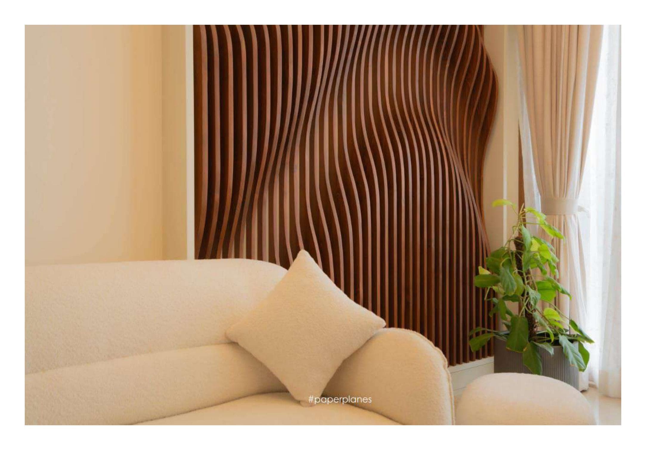
Start with a base neutral: warm whites, soft greiges, or muted taupes work well in Indian homes where natural light varies throughout the day. These tones provide a flexible canvas for furniture, art, and accent colours.
Apply the 60-30-10 rule as a starting point: 60% dominant colour (walls and large surfaces), 30% secondary colour (upholstery and curtains), and 10% accent (cushions, artwork, and decorative objects).
Consider the direction your room faces. North-facing rooms benefit from warmer tones to counter cooler light, while south-facing spaces can handle cooler greys and blues without feeling cold.
Don't forget the fifth wall — your ceiling. A slightly lighter shade than the walls can lift the room visually, while a contrasting ceiling colour can add architectural drama in rooms with high ceilings.
Test paint samples on multiple walls and observe them at different times of day before committing. What looks perfect at noon can feel entirely different by evening — and your living room needs to work beautifully at both.